I conducted a usability study to help improve a wellness app’s onboarding flow and help users better understand core features.
Graduate Project @ Pratt Center for Digital Experiences Research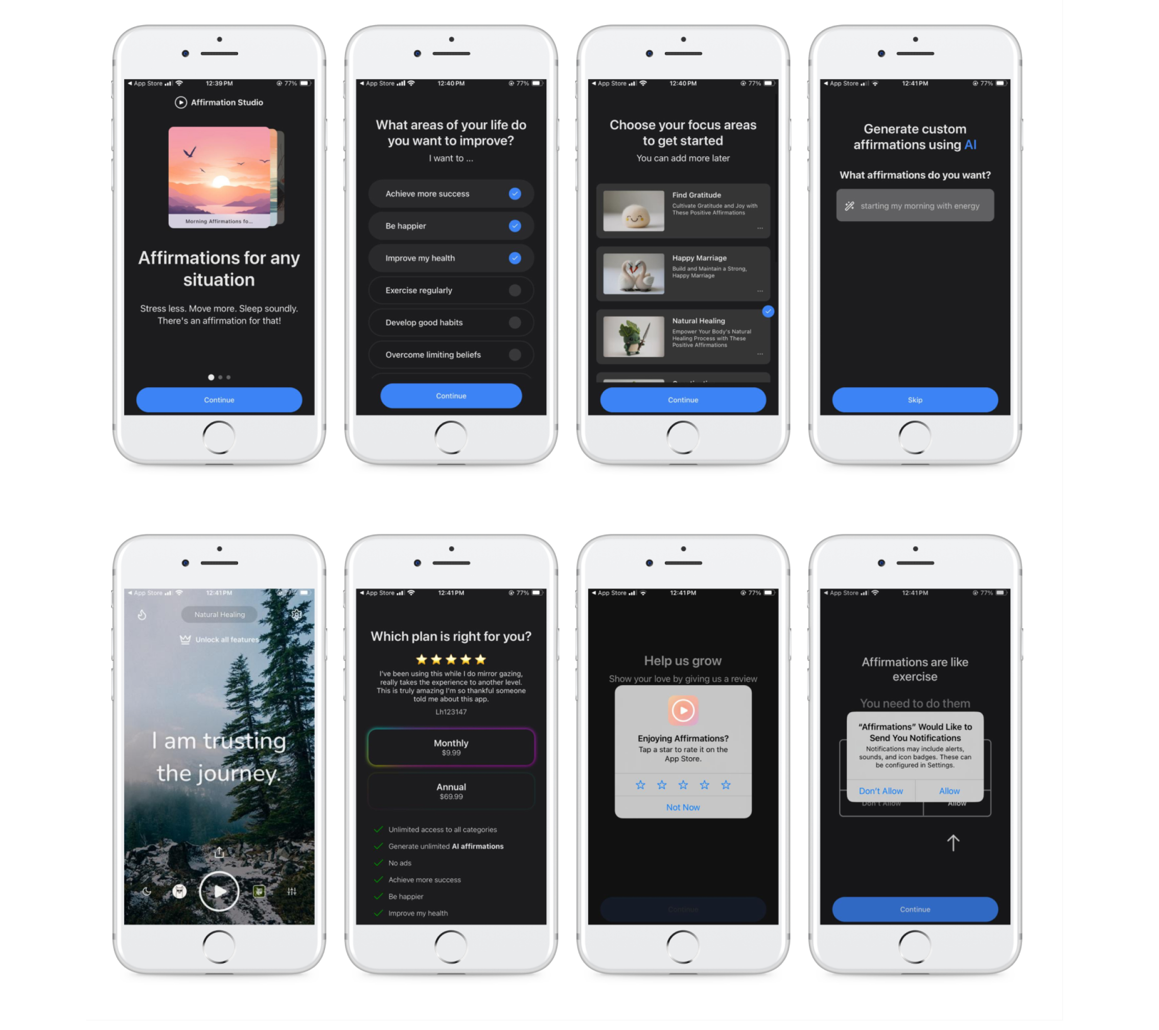
Through moderated usability studies, we identified two key issues:
❋ Onboarding Confusion4 out of 8 participants felt that there were too many onboarding screens and felt overwhelmed.
❋ Unclear Features 5 out of 8 participants struggled to accurately locate and use core functions on the homepage
ApproachUtilize usability study findings to create actionable recommendations for improving onboarding flow and facilitating a clear understanding of the app’s core features.
Reduce Onboarding Screens
Before8 onboarding screens caused confusion and overwhelmed new users, unnecessary steps made this initial flow time-consuming. Inability to backtrack & see what’s next led to frustration.
AfterReduced to 3 screens that prioritized core features and eliminated excess steps (rating, notification features), as well as added progress indicators and back buttons for added clarity.
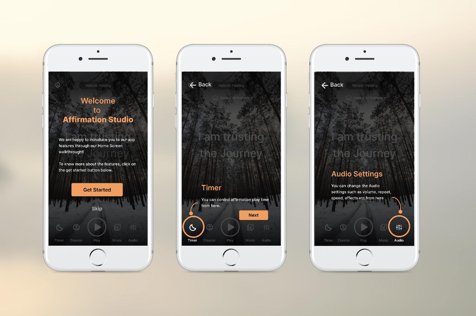
Add a Walkthrough for Core Features
BeforeParticipants were unable to find the many core features that were offered, and struggled to understand how to use them within the app.
AfterCreated a detailed walkthrough for first-time users once they hit the homepage. Helping users understand where to find features and how to use them.
Impact
We delivered recommendations that reflected research data and provided actionable solutions
❋ Stakeholder ApprovalOur work was met with approval from stakeholders by addressing their goals through accessible solutions.
❋ Data-Driven InsightsOur recommendations were consumer-focused and based on the metrics obtained from our research.