I redesigned the NY Transit Museum’s information architecture and visit planning flows, making it easier for visitors to plan their museum experience
Graduate Project @ Pratt Center for Digital Experiences ResearchThrough user interviews, card sorting, and tree testing, we identified two key issues.
❋ Navigation ConfusionCritical information was difficult to locate and the relationship between sections was unclear, which led to confusion for visitors when trying to navigate the site.
❋ Difficulty Planning VisitsImportant details for planning visits were unclear and led to friction & difficulty in the planning process, which was a core flow for most users.
ApproachRestructure information architecture with clearer content hierarchy, intuitive navigation paths, and better-organized planning resources to help visitors quickly find relevant information for their museum experience.
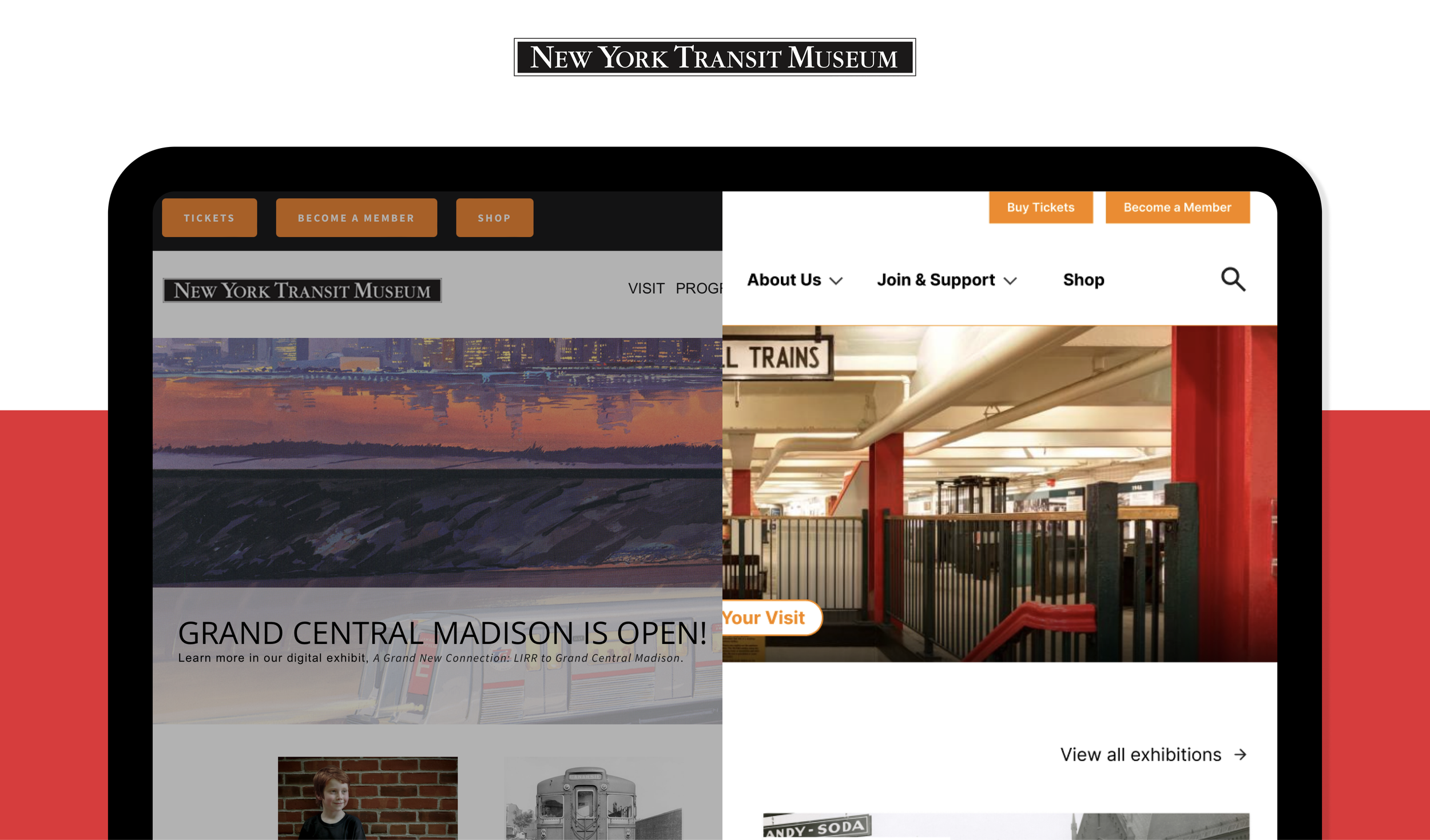
Navigation
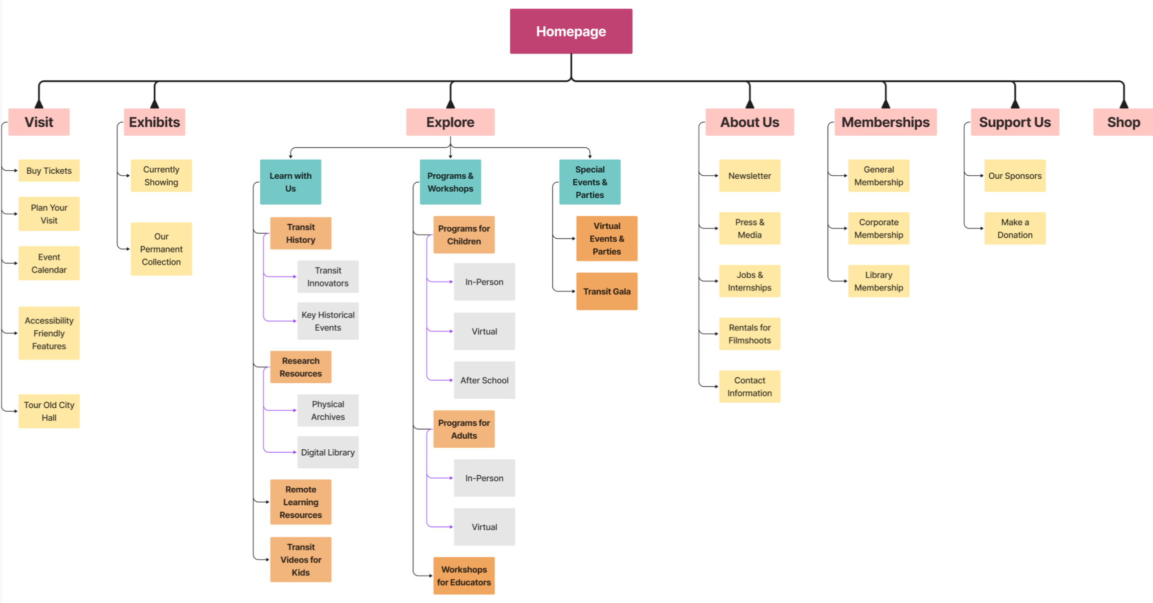
Based on the results of the tree test study - we decided to finalize on seven main pages resulting in a FLAT Info Arch framework.
We used the research from our tree test study to refine our site map and create a final version. We then ran a second tree test with this version, and found that our participants success rate in finding the correct pages rose from 56% to 73%.
Exhibits
Currently Showing/Upcoming Tabs
Added horizontal tabs to help users sort collections by what's "currently showing", this was the most common criteria identified in our research.
Visual Exhibit Previews
Combined images and text to make information scannable and digestible. Research showed users prefer visual previews over text-only descriptions when exploring exhibits.
Exhibit Highlights
Showcased feature images of exhibitions to provide visitors with a preview of what to expect during their visit, addressing user interest in glimpsing exhibits before planning.
Plan Your Visit
Grid Layout
Placed information in sections with images and icons to make critical visit-planning details easy to scan without cutting overflow text.
Icons to Simplify Information
Used icons alongside text to help users quickly identify and understand key visit-planning information.
Impact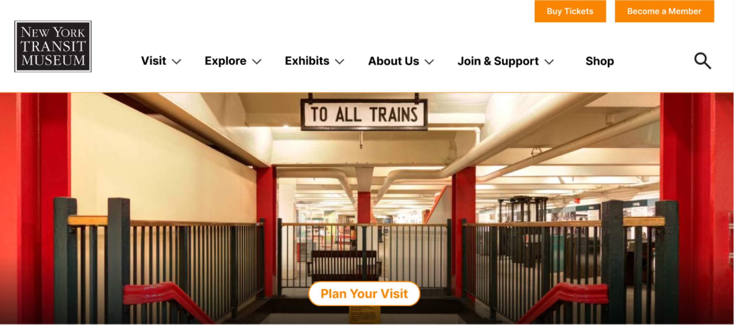
We delivered designs that satisfied stakeholders and performed well in testing
❋ High Navigation Success RateOur redesigned site map increased navigation success rates from 56% to 73% in usability testing
❋ Stakeholder RecommendationsOur redesigns demonstrated how improved information structure could resolve key visitor pain points in planning their museum visits