
I worked to redesign the Urban Glass sitemap and key user flows, making it easier for new visitors to find content and complete tasks
Graduate Project @ Pratt Center for Digital Experiences Research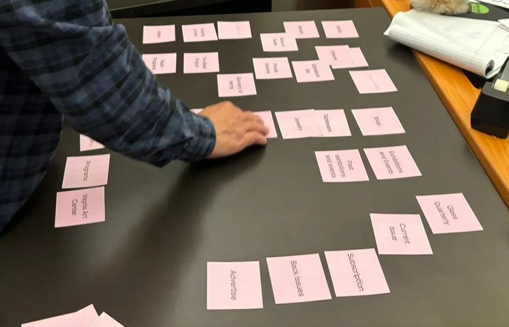
Through user interviews, card sorting, and competitive analysis, we identified two key issues.
❋ Content PromotionDesired content wasn't promoted enough and the purpose of each section was unclear, which led to confusion for new users when trying to complete important actions.
❋ Content ClarityContent lacked previews and summaries, causing misaligned expectations. Important information for core features was unclear and led to errors in booking processes.
ApproachRestructure key user flows with a top-down navigation approach, clearer content prioritization, and more supportive language to help new visitors quickly find relevant information.
Homepage
BeforeDense text, unclear value proposition, lack of visual hierarchy
AfterDesign promotes key offerings with clearer CTA’s & engaging visuals
Education
BeforeOverwhelming course catalog with no clear entry points, buried information, and lack of visuals to aid navigation
AfterMade it easier to explore courses by highlighting upcoming classes, providing multiple search options, and visual tags for filtering
Magazine
BeforeUnclear distinction between print magazine and online content, causing confusion about what was accessible digitally
AfterRedesigned the layout to resemble a product page, clarifying that Glass Quarterly is a physical magazine and can't be read entirely online
Impact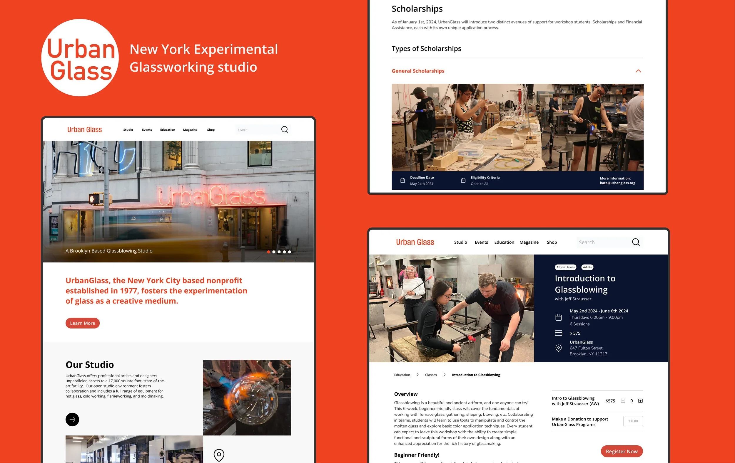
We delivered designs that satisfied stakeholders and performed well in testing
❋ Director ApprovalOur work was approved by Urban Glass’ director, and aligned with the company’s vision going forward
❋ High Discoverability & Success RateOur site map produced a high success rate and content discoverability when tested on new users