
Reimagining Personal Growth App Onboarding
Over the course of three months, I worked with a team of fellow designers to optimize the first-time user experience for a mobile wellness platform to better communicate value proposition and increase user engagement. Research insights led to a streamlined onboarding flow that helped users understand core features faster.

Background
Who Was Our Client?
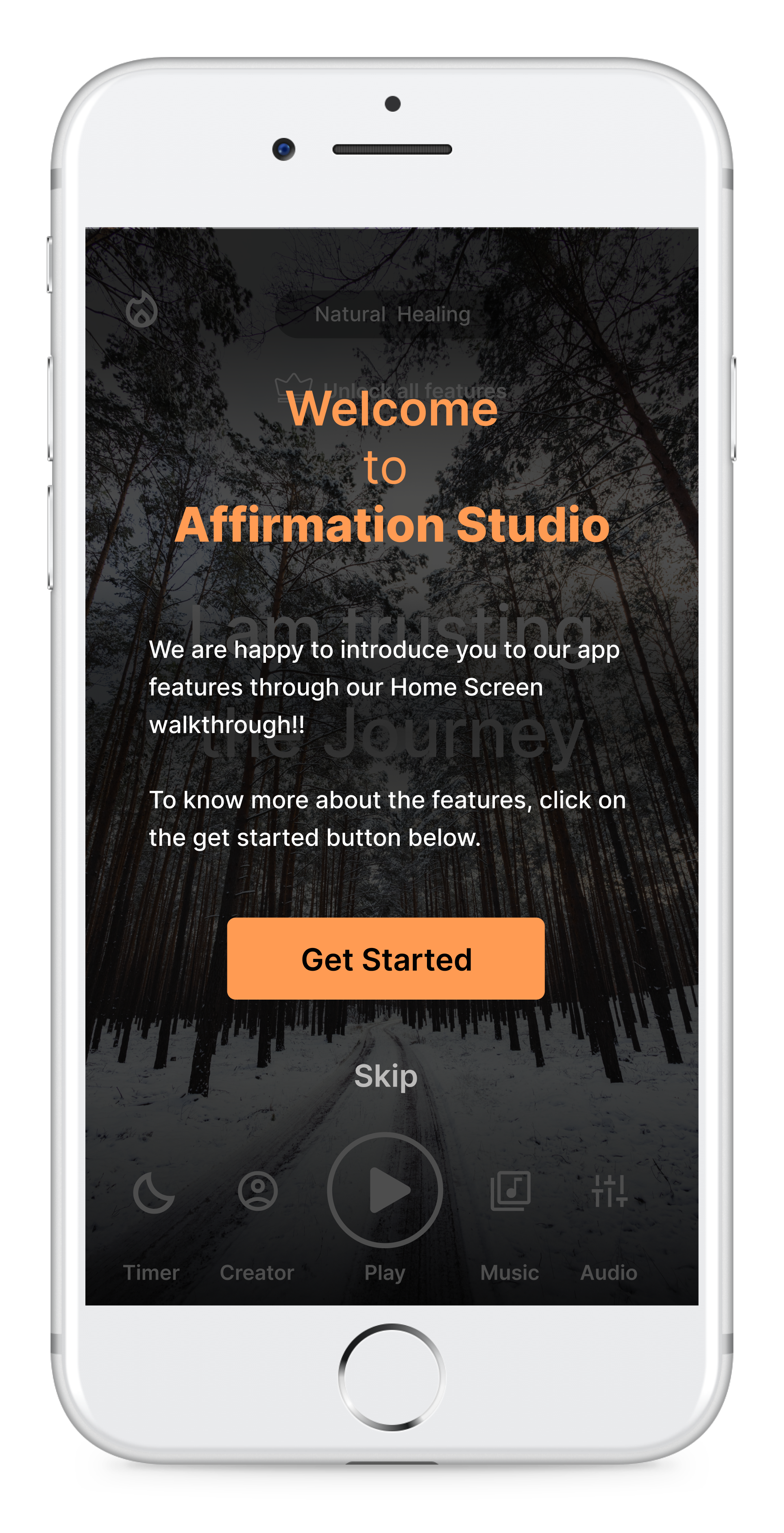
Affirmation Studio is an app for users looking to cultivate a positive mindset through the power of daily affirmations. Affirmation Studio’s app gives users the ability to personalize their daily affirmations through a wide range of customizable features. I conducted a usability study with a team of 3 fellow students to assess usability issues and provide recommendations.
Problem
Existing issues within the website
Our client’s goals were to gain a better understanding of how to improve the experience for first-time users, as well as find ways to encourage these users to pay for a subscription upon onboarding. We knew we needed to focus our study on people who were interested in personal development, and had the means to potentially pay for this kind of service.
As a result, we identified our target audience as young professionals who were interested in personal development and mindfulness apps and who were either actively using one or had used one previously.
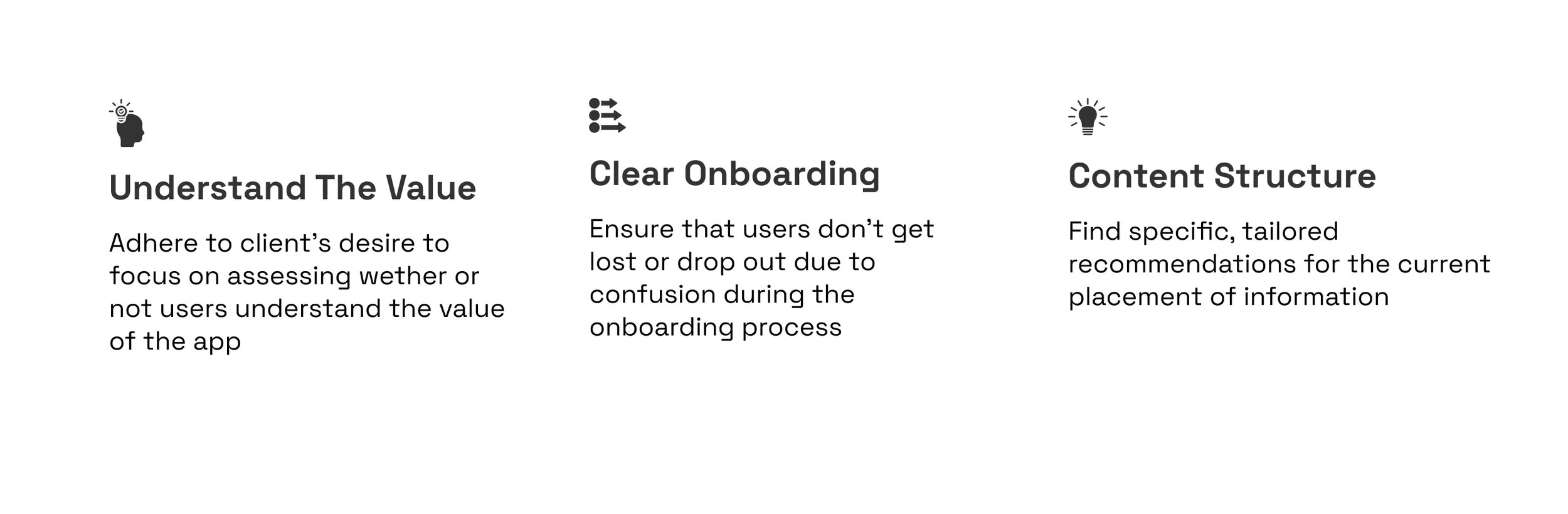
Solution
We presented 3 actionable recommendations to our clients


Process: How did we get there?

Research Method:
We decided to conduct moderated, remote usability test with 8 participants.
Moderated testing allowed for us to engage with users and encourage them to “think out loud” in order to gain full insight into their thought process + experience while using the app. It also allowed for us to ask any questions that arose on the spot, which a unmoderated test wouldn’t allow.
Remote testing was best suited for our project because it allowed us to utilize screen-sharing features to record exactly how people navigate the app in real time.

Key Findings
-
100%
8 out of 8 participants would NOT pay or rate the App before using.
-
62.5%
5 out of 8 participants struggled to accurately locate and use functions on the home page
-
50%
4 out of 8 participants felt there were too many onboarding screens
Key Strengths
-
Engaging Visuals 🖼️
Participants were excited by the use of visuals on the home page.
-
Personalized 🔮
Users appreciated the ability to tailor their affirmation experience
-
Payment/Rating 💵
Users were more inclined to rate and pay for the app after they had a chance to use it
actionable recommendations based on our findings
O1. Provide Walkthrough
O2. Indicate Progress
O3. Reduce Onboarding
rec 1: Providing a walktrough
Strategy and decisions taken:
Our participants had difficulty correctly identifying and using the various features on Affirmation Studio’s home page. Our recommendation was to provide a walkthrough that appears once users reach the home screen after onboarding. This walkthrough would serve as a brief tutorial for where to find and how to use all of the features within the app. Users would also have the option to skip this walkthrough.


Before:
After:
rec 2: strategically time core prompts & reduce onboarding time
Strategy and decisions taken:
We recommended reducing the amount of onboarding screens by suggesting that the payment, rating, and notification pop ups be introduced to users after they have navigated to the home screen, as 100% of our participants said they would decline to agree to any of these features at this point in their experience. With our suggested reduced onboarding process, users can access the home screen more quickly, and might therefore be more open to agreeing to the notifications as they’ve now been able to interact with the app. We decided to also remove the generative AI onboarding screen, as 100% of users were unclear of how to utilize this feature especially during this stage of their experience.
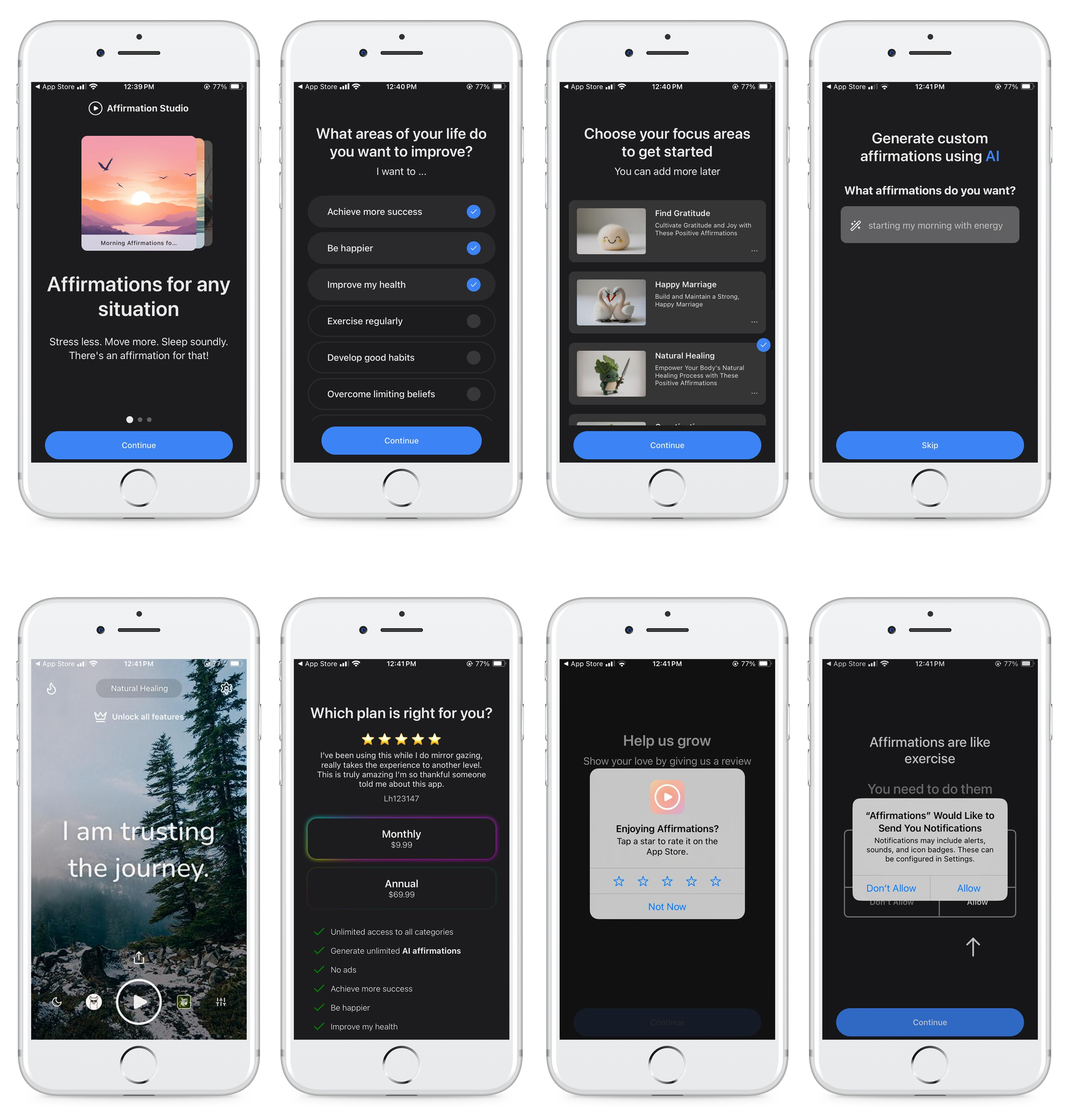
Before:
After:
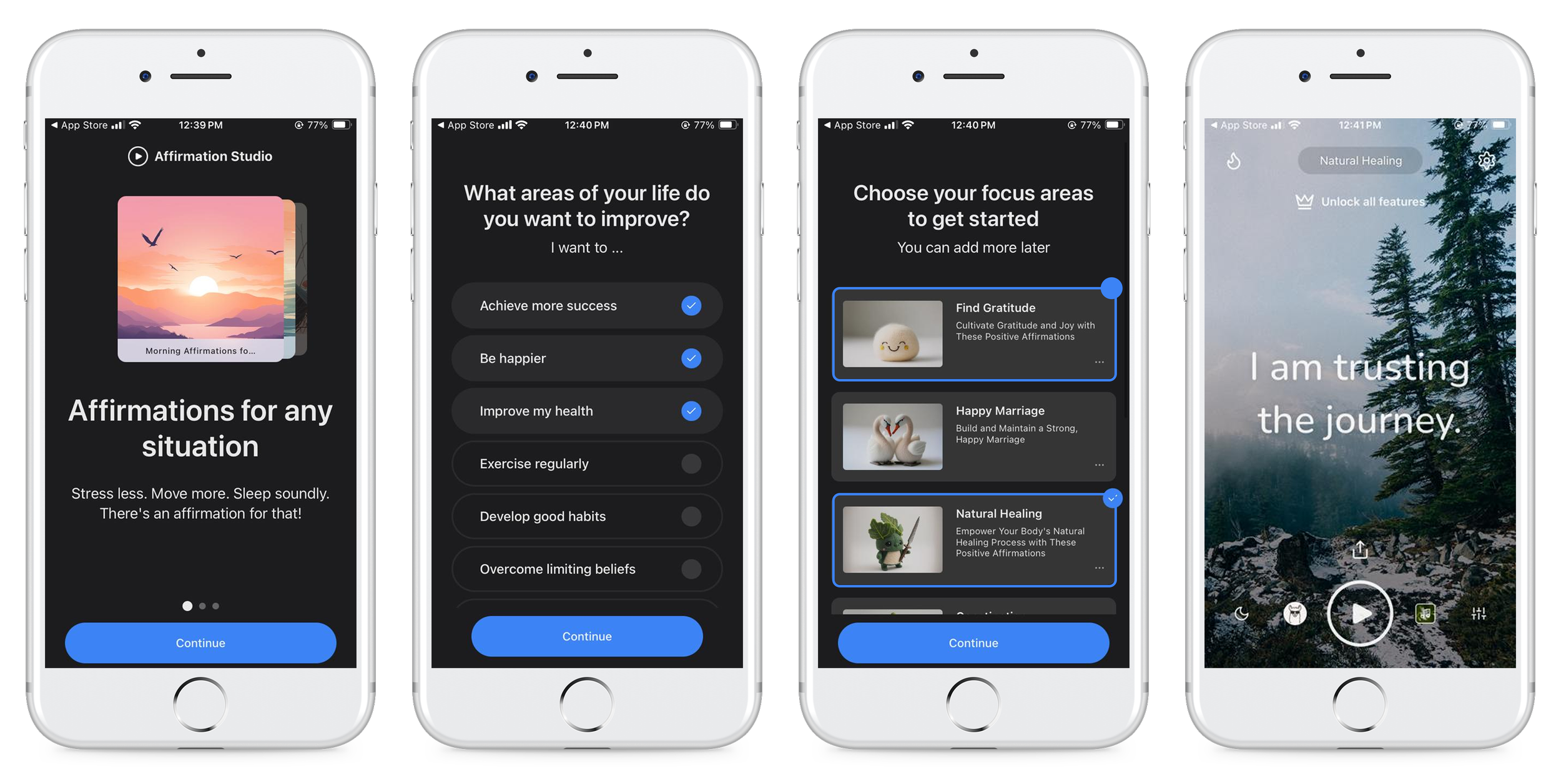
rec 3: add a progress indicator + Allow for toggling between stages
Strategy and decisions taken:
Our participants felt confused when navigating onboarding screens as they found it difficult to backtrack and understand their inputs in relation to following screens. Our solution was to include a progress indicator at the top of the screen to show users where they were in the process of onboarding, as well as provide a clear button to go back and edit their inputs as they wish.

Before:
After:

Presenting our study to stakeholders
Once we synthesized our findings and translated them into actionable recommendations, we built a presentation deck to share with our clients. Our presentation focused on explaining our research process while also highlighting the value of the methods that we chose, as well as pulling the key findings from our research and breaking down the accompanying actionable recommendations.
Moving forward
success metrics
Implement our recommendations and conduct further user testing to validate and find additional areas of improvement.
Observe increased subscription rates, and increase in user rating + feedback.
A more intuitive and clarifying onboarding process should allow users to effectively understand the value of the app, more confidently utilize key features, and encourage subscription.